Table of Contents
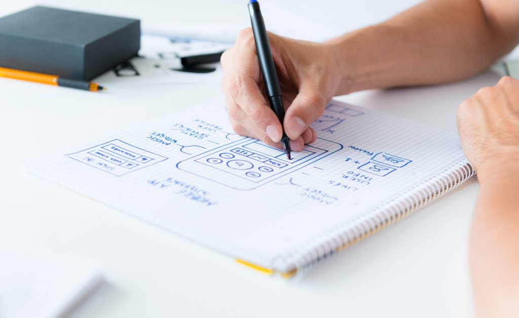
What we talk about when we talk about mobile app design? Essentially, we’re addressing everything visual that appear front and center before the end user’s eyes, right? Mobile app design is nowadays referred to as UI/UX design. Nevertheless, it is the same program interface design just adapted to smartphone. UI/UX design is a mobile sub domain of design in general. Developers and business owners focus on UI/UX design because smartphones are a dominant market now and, unlike laptops and PCs, we use our hands instead of a mouse. This and many other small and big differences require a different approach, which is why User Interface/User Experience kind of design is focused specifically on the apps on the smartphones.
We have previously covered many aspects of UI/UX design and its critical role in shaping the final product not only in terms of how it looks but also regarding its usability. In this article we are going to cover paint points, issues and challenges that UI/UX designers face in their work. Knowing how to deal with these problems is crucial for the sake of adequate design development.
Less is More
When it comes to design, less is definitely more. Paradoxically, it means to avoid as much bloat as you can. In software design everything should be engineered as simple as possible but not one bit simpler. To find this thin line is not always easy and that’s why many apps on the market illustrate terrible design decisions when the amount of features seems to create value but their arrangement ruins the whole deal.
The principle “less is more” is not just about minimalism. It is about maintaining a delicate balance between high efficiency/usefulness and vivid design that has no unnecessary elements being at the same aesthetically rich. For Apple doing a phone with just 1 main button and introducing touchscreens was such a decision and it revolutionized the whole world. The “less” part was the absence of buttons and the “more” part was touchscreen. This is a kind of thinking talented UI/UX designers should lean towards, although it requires a solid creative input.
Time and Budget Constraints
Not only design but the whole development cycle is greatly influenced by 2 things: time and budget and they are correlated. A designer will do poorly if given little time or underpaid. Unfortunately, many clients seem to undervalue the input of designers because they somehow tend to think that to just add another button or a change a gradient is so easy it can be done in a matter of minutes.
In good design everything is connected and even layers of color serve a variety of purposes, so to introduce even small change require more time and means additional work/expenses. When designers are pressed too much their will think less of the whole, focusing on the little things clients want to change (and they always want to change something even if the reason they don’t like a particular color is “just because”) and delivering less creative input.
Luckily, project managers and business analysts come to help. They negotiate terms and conditions for designer who then are free to do the good work in certain time.
Android Fragmentation
There is iPhone and then there are thousands different Android devices running 2-10 Android OS versions. And each smartphone manufacturer like Samsung or Xiaomi tend to personalize and make its version of Android OS somehow different. Smartphones have various display resolutions and a myriad little details that change from one phone no anothers. Designing for Android (like development too) is much more difficult than it is for Apple devices.
To deal with designer follow Google’s guides and focus on the most recent updates and the most widespread Android phone models. Android design, like Android development, usually takes a bit more time to complete, although in some cases it allows designers to make design choices impossible to do on iOS platform.
Animations, Gradients, Layers and Other Horrors
Even the simplest design requires scrupulous work. But, when it comes to gradients, layers or animations, designers go out for a smoke. Yes, UI/UX design has become simpler to use but also more difficult to produce (think back about “more is less” principle). Minimalism requires more sophisticated underlying technologies, so the end users have everything they need while it seems like nothing is going on. That is a secret.
Animations are tricky. They are used rarely because they tend to distract or even annoy users. But sometimes they can be very catchy and do the opposite – show user that something is happening. It is always a designer who decides whether to use a static image or integrate animations to make user story more visually compelling.
Challenges of Professional Self-Actualization
Innovations and software development progress move so quickly. Many designers are confused by it because they are no longer just visual storytellers, since they craft the interactive process and decide how the app is going to work, how the user is going to behave and what would the whole process bring to the table in the end. Many UI/UX designers often think they don’t know what is it they do and some companies even break down the title delegating UI tasks to one person and UX tasks to the other, some use a front-end developer to do both, others require designers to conduct some kind of marketing research.
Due to all these reasons close collaboration of the development team is necessary in order to deliver the end product that will satisfy core target audience. We live in an interdisciplinary age. Job title shift and mix and specializations diversify blending altogether in some kind of a professional melting pot. Communication is vital for all IT specialists because a single opinion of an expert is not enough for a product that will be used by thousands of users.
Learning is constant and so every UI/UX designer takes something from marketing side of the project to know its business objectives, consults a lot with developers, negotiates terms and conditions with project managers/business analytics all in order to know their role better and to have a glimpse into the future trying to guess what the ideal final product will look like.
Dealing With Consumer Psychology
And that leaves us with consumer psychology. Take a regular designer who has a taste and is creative. A good specialist will want to change the world even if the world doesn’t want to be changed. This specialist’s flowing creative juices are a valuable asset but this river of energy should be directed towards a correct destination – satisfied business owner and satisfied end users.
It is exactly because of this that UI/UX design has got its name. The change is equivalent to that of a writer and a copywriter. A UI/UX designer who understand business side of the product development and relates it to consumer psychology is more likely to succeed. Otherwise, copywriters would write poems in their ads and designers would insert beautiful but useless art wherever they can.
Summing Up
The problems are numerous but it is exactly a commitment to overcome them which result in a magnificent arrangement of detail into a final composition – nice to look it and nice to use it application both useful and aesthetically vivid. And since this blog post hasn’t been written in verses, so is your app should not compromise its content for the form. The trick is to keep a delicate balance between the essence and appearance.


