Table of Contents
In 2022 it is hard to imagine a company selling service or goods without a website and digital productivity tools. Businesses and company owners understand the power of digitalization and embrace it eagerly. However, not all of them do it right. We’ve noticed that many clients of development agencies are mainly focused on website or app functionality, and they do not pay enough attention to UX and UI design.
This is a faulty strategy and a big mistake, since designers can bring so much value to any digital solution. With the help of the right UX and UI design you can influence customers decisions, gently push them to choose your company over the others, and provide incredible customer experience. But that’s possible only if you manage to create the right UI design.
Therefore in this post we’d like to share with you some examples of bad user interface design, explain how to avoid common mistakes and expectation/reality disappointment, and also provide some pro tips from our award winning design team. Let’s wait no further and delve into this utterly interesting topic.
What is a user interface and user experience?
Before we proceed to describing the real value and influence of UI design, we think it is important to speak in general about user interface and user experience. While UI refers to the visual part of a website or mobile app (screens, buttons, icons, loaders, etc.), UX is all about interaction with the digital product.
While UI targets visual aspects, UX deals with the emotional part of the whole digital experience and interaction with the product. That is why the designers that work on project look and usability should possess certain skills. Take a look at this infographics to understand better what they usually do:
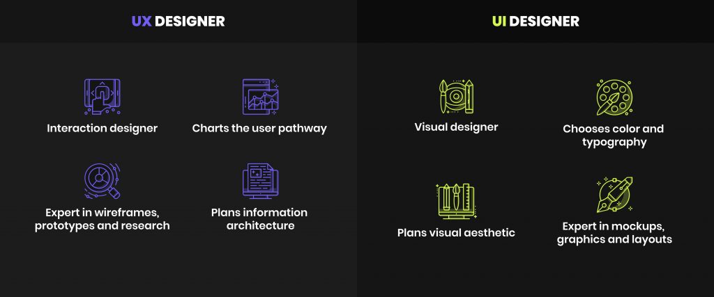
All designers know that a right UI and UX design can be a powerful instrument able to convert users into customers.Since the competition on the market is tough it is important to create impeccable products with the design that sells. If a solution has bad UX design, even the top marketing specialists will not help you to boost its popularity on the market.
The users became very demanding, and taking into account the wide variety of options they can choose from, bad user experience and app design can drown even the project with the best functionality. After all, as they say fine feathers make fine birds. And here is an interesting statistics that proves our point:
- About 75% of online customers make their judgment about a website’s credibility based on its overall look and design. So chances are that if the design is poor the website will be left quickly. And of course there will not be any purchases.
- Almost 60% of mobile app users claimed that they will not recommend a business that has an app with a poor design, because 94% of the first impressions are design-related.
- 70% of generation Z, which is one of the most internet-dependent and does most of the things online, claims that they expect intuitive experience from websites. At the same time millennials expect to see more new design trends and have pain-free user experience.
- And last but not least, according to the business report, every $1 invested in UX design brings $100, which implies a ROI of 9,900%. Impressive, right?!
The real value of the app design
It is hard to underestimate the true power of the design, especially when it brings so much value and so many advantages to business owners. The list of them includes but is not limited to:
If you ask us what is more important UX or UI design, we will tell you that the right combination of both is what every modern website and application needs. It doesn’t really matter whether you are building a solution for customers, employees, or huge enterprise departments, since it has to offer not only a rich functionality but also a certain level of engagement.
A great app is one where high-quality code is wrapped into user-friendly and eye-pleasing design that does not require constant major improvements and investments. That is our recipe for success on the digital market.
What makes a bad UI: Never make these 8 mistakes
Now that you know how important it is to focus on the look of your solution and provide a pleasant user experience, it is time to check out the examples of bad UI design.We can say for sure that there are so many different factors that can ruin the whole experience and impression about your solution.
We don’t want you to make common UI design mistakes that can increase the development time and cost of your solution. Therefore, we’ve prepared a list of bad examples that will help you to understand how not to build user interfaces.
#1 Low contrast and bad text readability
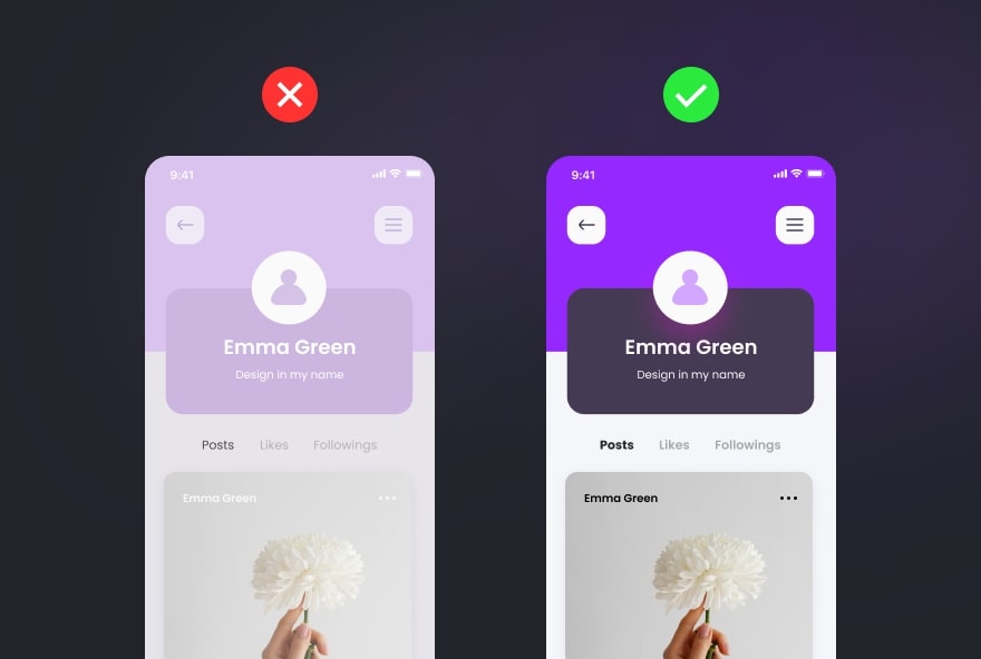
You probably would agree with us that being unable to read something is very annoying. And that is exactly what happens if you use low contrast, not enough dark patterns and too light background and text on the page. In this case all website or application elements turn into a messy interface that aggravates user experience.
The best advice we can give you to avoid issues with contrast while designing your solution is to follow the steps below:
#2 Not responsive design
One more sign of a bad UI design is absence of responsiveness. These days users tend to have different mobile devices, tablets, and laptops with different screen sizes and resolutions. So it is crucial to create solutions that will look and function good on all devices.
Chances are that if users had a bad experience and horrible interaction with one website or application, they are likely not to use it ever again. And you definitely should not let this happen. So it is highly recommended to use the best practices of responsive design creation and make your solution mobile-friendly.
#3 Inconsistent style
We often observe one common mistake many businesses do when they design their company website or web portal. They tend to use different styles and key elements of different site pages. So by visiting that website you see inconsistent style, a variety of color shades, and sometimes even different text fonts. It looks messy and not user-friendly at all.
Therefore to avoid inconsistent and bad UI design we would suggest you to follow these key rules that will lead to visually pleasing results:
#4 Irrelevant images
When it comes to images on websites or in applications, we often see one common mistake. They tend to be of a bad quality, irrelevant or even taken from photo stocks. There is nothing wrong with taking your images from those resources, but you should do it wisely.
The image as well as text should convey a certain message. They are used not only to break up the text paragraphs, but also to have their own meaning. So instead of using irrelevant pictures, insert some screenshots of your solution, add some useful illustrations. And last but not least, make sure the images are of a high quality, the image is not smudged, blurry or pixelated.
#5 Horrible iconography
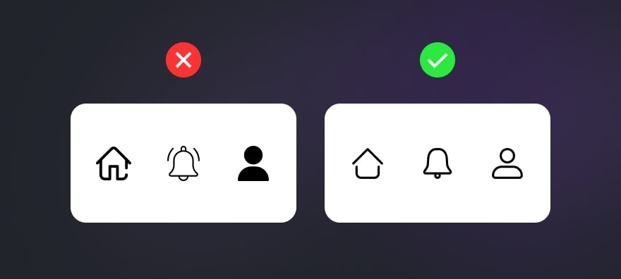
As well as images, icons should convey a certain message and preserve the selected design style. They should not be too big or too colorful, and they should not confuse the end users.
Based on our experience, we can say that it is better to use icons in SVG format, select a certain style for the set of the icons, and make them of the same thickness and size. Here is a visual example what you shouldn’t and should do when it comes to iconography:
#6 Lack of engaging elements
Every user enjoys a fun digital experience, therefore you need to take care of it if you want to increase time spent on your website. Add interesting loaders, let users share text or else to Twitter or Facebook, add animations and videos, ask users to leave comments or feedback.
In case you have a blog or some content that can be evaluated, then add some clickable elements letting users appreciate what they’ve read or seen. Encourage your users to do some actions and make your digital product interesting.
#7 Mobile-unfriendly touch targets
What can really spoil overall user experience is the poor difference between the buttons and inability to use them. When you design a website or application it is crucial to remember that it will be used on mobile devices. Therefore it is wrong to make too small buttons of a weird form that can’t be clicked on a smartphone screen.
Always keep your end user in mind and create mobile-friendly touch targets, do them wide and big enough so that the chances of click accuracy can be higher.
#8 Improper contact forms
Inconvenient and confusing contact forms can prevent any user from filling them and reaching out to you. It is a well known fact that contact forms help to convert website visitors into customers and you should not neglect them while working on the website design.
While creating contact forms, make sure you provide a message of the error and not only indicate it with color. Do not use too long forms with many fields, because users will not fill them all in. Add several key fields and that would be enough to get all necessary contact details and questions.

Key characteristics of a good UI
All professional UI designers know that the look of a digital solution should not only be pleasing for the client, but also compliant with the certain design standards and requirements. They all are easy to find on the Internet, but not so easy to follow especially when you have a certain wish list from a client that contradicts the rules.
Therefore apart from all the standards, there is a short list of key characteristics of a good UI that all designers know. A great user interface design should be:
all elements have the same style, high quality photos and videos convey the meaning, and it is easy to navigate through the website. the design is not overloaded with graphics and elements and helps to focus the user’s attention on important aspects that the website attempts to sell. the design and its elements including the navigation are understandable for every user and do not cause any confusion. since it is all about usability, the application or website should be able to load fast. The perfect load time for the home page should be no more than 3 seconds. since users prefer doing a lot of things using mobile devices, it is reasonable to make design mobile-friendly and adapt all buttons, elements and icons. Responsive design is your key to success in 2022. the layout of your application or site should be well thought-out and logical, so before working on actual design try to create examples of wireframes and different mockups, revise them and change if necessary.
How to create incredible design: Tips by our UX/UI designers
We know firsthand how bad UI can spoil the impression about the project, even if it is the most useful and incredible one. For more than 10 years in business we had clients who came to us with the request to redesign their websites and apps and improve user experience. Those clients had different businesses and absolutely different solutions, but they all shared the same problem – bad UI design and sometimes even bad project usability.
Since our design team helped many clients to modernize their solutions and created lots of designs from scratch, now we have enough expertise that we’d like to share with you to make your development and design journey more pleasant. We’d like to point out some tips helping to create incredible user interfaces.
Explore carefully your target audience
Your idea will come a long way before it will be turned into a real project. The design and development process take time and have many risks. Therefore to minimize them, it is always better to complete a thorough preparation also called a Discovery stage.
We always recommend to explore the portrait of your end user, point out what needs and preferences they may have, their age, profession, interests, etc. All these aspects influence how people interact with apps and what they prefer to see in the design.
You need your app to solve a certain problem for your target audience and the design should help with this as well. By knowing your target audience you will be able to design a solution that will be attractive, useful and comfortable to a certain group of people.
Be strategic and purposeful
Whether you are creating a layout, selecting backgrounds, colors or textures of the application, you should be strategic. Every element of the design should be well thought-out, make sense and be visually pleasing.
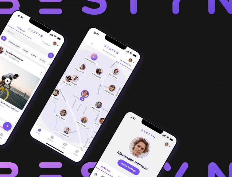
Proper selection of colors and placement of elements can draw the attention to the most important information or options that the solution offers. Speaking about the examples, let’s take one of our apps – Bestyn. This is a multifunctional platform for communication, posting news and stories, and promoting local businesses.
Since the application has many options, we needed to create a feature-oriented design to represent a lot of information in the right way. We created a light design with color gradient, and added an option to hide navigation elements not to distract users from the content. Such a design was created with the end user in mind and it allows them to enjoy seamless browsing and creating experience. Here is how Bestyn app looks:
Make interfaces simple and clear
Sometimes in an attempt to create a perfect design for apps and websites, designers may end up making interfaces overloaded with unnecessary elements or colors. All in all, this only creates bad user experience. Simplicity and clarity always work better, especially if you build a solution for business.
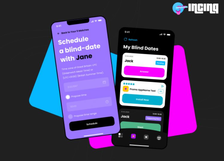
Let’s take one dating application that we created to illustrate how minimalism can be advantageous. The solution we are referring to is INCINQ, a blind dating application with a dark color scheme and retro wave UI.
The client selected only several colors but wanted the screens to differ from one another. And our designers managed to do this and even a little bit of extra that turned this minimalistic look to a whole new level and made the user’s interaction and experience with the app more natural. Just check out how cool INCINQ screens look:
Follow visual hierarchy
To embrace visual hierarchy is the golden rule for all designers. Basically there are three levels of it that include:
- primary one – consists of content elements of the page including navigation menu and page headings;
- secondary one – it includes the main content of the webpage;
- tertiary one – it includes the footer of the page and its sidebars.
To emphasize visual hierarchy properly it is always better to use contrast to make elements appear differently, place elements on the page evenly, use different colors for elements of different purposes, use fonts of proper size, and limit the number of used textures. It is utterly important to avoid messy and cluttered look, and make all the text readable.
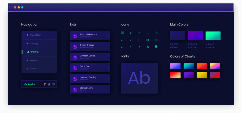
We had one complex project that required the design with proper visual hierarchy. That solution was a trading platform called Ticker Tocker. For this platform, our designers selected a dark color scheme to highlight important elements, a certain set of understandable and meaningful icons, proper fonts and secondary colors for charts. Here is a picture demonstrating it:
To wrap it up
In our fast moving world trends come and go so fast. So when it comes to project design it stopped being only about the trendy look in certain colors and shapes. Now it is rather about the combination of visually pleasing interfaces and convenient user experience.
Different solutions require their own unique designs able to communicate necessary messages to the end users. However, it is not so easy to create such designs, and you may face many issues and make many mistakes, some of which we’ve covered in this post. Only a professional team of designers like Altamira can help you do everything right and avoid huge time and budget loss.
FAQ


