UX design is vital as during the interaction with the product, users are fully focused on the actions they take and the tasks they expect to finish. User flows help to better understand and predict the expectations of future users. Consequently, it helps to create a highly qualified and suitable product design. User flows describe the entire user path through the product via digital visualization. To create a convenient and useful final product, UX designers resort to a wide range of diverse tools and research in a particular area.
How do user flows show the potential user interaction with the product? We are going to discuss this and other user flows features further in this article.
What is the user flow?
The process of user interaction with the product can go in different ways. User flow is a digital or written visualization of the options that can be performed during the app or website use. This flow starts when a user enters the product and gets to the home screen or page, and finishes when a user performs the final act like ordering the product and signing up. User flow visualization makes it possible to analyze and improve user experience and general app rates.
Due to Forrester analytics, the better UX design is, the bigger conversion the application gets. Better UX can increase the conversion up to %400.
Forrester
Why do you need user flows?
User flows help to monitor how affecting UX design is through the analysis of users’ behaviors while interacting with the product. They demand constant changes and improvements to keep up with users` expectations. User flows are beneficial for building or rebuilding the app or website design. We would like to discuss the situations when UX flows are required.
Types of flow charts
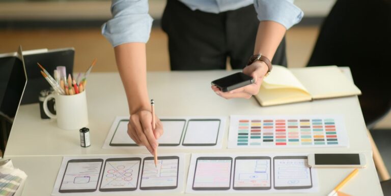
User flows are usually divided into small parts that consistently created one after another. These parts are called flow charts and have the features counted below.
Task Flow

Task flow focuses only on one task performed by the user. This flow shows the interaction with the product but only for performing a particular task. It means that task flows provide the picture of one path that the user takes without any other pathways as the user flows. This phase contains specific elements that mark future actions that are well-known for most designers. Among them are:
- action circles
- icons
- select elements
- data input elements
- rectangle steps
- decision diamonds
Wireflow

Wireflow unites wireframes and flowcharts. Due to this combination, designers and their clients easily can see future interactions with the product. Wireframes help to show the scheme and design of each page but these pages don’t communicate with each other. Each screen affects the general user experience through the product.
User Flow
The user flow`s main aim is to provide a responsive design for the product. It shows the ways of future interaction between app and users. User flows are focused not on tasks but on individual entries as users choose different pathways through the application.
Benefits of user flow
User flows play a great role in delivering excellent UX design. They count the range of benefits that make the UX more efficient and qualified for future customers. We would like to highlight the advantages of considering the user flows in the UX design building.
User flows vs user journeys
As we have already found out, user flow depicts stages the user takes following a certain set of features. The user journeys are considered to be a high level and deal with one user`s end-to-end experience with the product. The user flows` main aim is to discover new features. User journeys usually contain information about user goals, key stages, and insights.
The user journey map helps to track the user experienced during the interaction with the product. It is a kind of customer visualized journey through the product. A user journey map is a live journal where users usually note their success and failures. The user journey consists of several layers and it doesn’t depend on specific elements. The user journey can be described as the backside of the system that provides the required information. All in all, the user journey tracks the customer’s feelings during the interaction with the product. User flows or UX scripts are the customer’s entire experience through the product. It is a hybrid of typical block-system and visual interface elements.
The user flow creating process helps better understand the product specifications. They show several scenarios of user interaction with the product and process each of them to get a user-friendly and convenient final result.
Yana – Altamira designer
User flow is based on the tasks and activities performed by customers. It is a sequence of customers’ actions and helps to monitor if all processes end logically. User flows show the product`s solution point. Compared to the user journey, user flows are not connected to customers` feelings but aim to show the product work process. The user journey cares about user experience a lot and helps to reveal the positive and negative points. It can describe solutions from different sides – mobile app work as well as server system work.
Best practices to design user flows
User flows should be clearly visualized not only for designers but for the clients too. They have to avoid confusion and mistakes. There are different practices on how to produce intuitive user flows and we would like to describe the best of them below.

1. Descriptive name
User flow should contain a detailed and accurate description of what it implies. The titles of all options that users will take have to be clear and simple. Each flow action should be separated to avoid mix-up in documents.
2. One-directional flows
User flows have consistent and simple architecture. They should not look like a complex system with many options. A golden rule is one action that responds to one-way flow.
3. One goal for one flow
Each user flow has its goal – complete a task for users. This process should be streamlined and has no interruptions. When a user performs a certain action, it has to be finished at a time with no distractions. Every action should be sequentially completed.
4. Always have a legend key
Building a user flow visualization, you should consider using your own keys to mark particular objects. These keys help to easily understand and define the entire picture by clients. Designers have to mark screens, entry points, and other visualized shapes.
5. Decide on an entry point
User flow starts with an entry point that should be clearly marked. This point defines the following consistent actions during the interaction with the product. As the user enters the app, it has to respond to his expectations like it has to be the home screen, log in, etc. User flow has to be a start-to-end journey with no distractions.
6. Select colors wisely
Color selection is also an important step in creating product design. This stage has to be included and visualized in user flows. It all depends on the particular project. Some clients require design that corresponds to the existing brand colors. Other customers expect new and creative ideas that will be a perfect match for their app or website. Moreover, user flow elements need to have specific colors to be easily recognized.
How to use user flows in the design stage
There is no right time for user flow implementation in the design stage. It is usually integrated before the first sketches. However, there are several tips that are worth considering in creating the user flows.
Mobile app user flows examples
Delivery app
The delivery app design contains vast and clear wireframes where each element is marked on the screen. The user flow is simple and implies sequence – landing page, choosing a language, entering the address, and sending the information (order).
Music app
Music apps usually have creative and bright designs to attract and engage more users. The user flows are complex and simple at the same time. It all depends on colors, schemes, and navigation. the navigation between screens is not actual, so taps and swipes are better choices for music app UX.
Apple Watch app
Apple Watch user flows are conditioned to universal as they can monitor the user’s path through the small device screen. This example of user flow is rather simple, understandable for new users, and attractive. Everything starts from the Apple Watch home screen and then flows in a single direction. Users can type short notes and change the screens with fast tap indicating. The screen implies sequence to avoid any mix-ups.
News app
News app user flow has to be clear and convenient in navigation. Users have to get what they are expecting from their app experience. For example, after logging in, the user expects to go to the home screen. These options are not available for people who haven’t signed up. The home screen provides particular options like settings, menu, and categories, own profile or dashboard, newsfeed, etc. The news app wireframes are simple and consistent.
How to start creating user flows?
There are no rules or standards in creating user flows. The only thing that should be considered is the simplicity and clarity of the schemes for everyone who sees this project. It is not obvious to follow the standard scheme with arrows and blocks. You can use any marks and elements for drawing the user flows. Each element has to be placed consistently and visually adapted to the project brand. The process of creating these elements is not really complex but demands much time to make everything accurate and clear. Of course, there are many digital tools that can be applied and make the user flow creation more productive.
For building user flow, our Business Analysts usually use such tools as Miro and Draw.io.
FAQ
All in all
Design intuitiveness defines product success in the modern market. The simple interface is more likely to be chosen by users as it is clear and contains no confusion. If the user flow goes fast and easy, there is more chance that the user will return to the app or website. Due to digital tools, UX design can be simple but creative and efficient at the same time. Design visualization ensures clients that their interface will be a perfect match for their audience and will respond to all users` expectations. If your app demands to improve the user experience, all you have to do is to contact our designers to find a suitable and qualified solution.


