Web & mobile social network Drophook
From discovery to maintenance, we have implemented the US-based Client’s idea to life and delivered a mobile app for fishers, providing all necessary tools, starting from fish measures and ending with weather radars and navigational maps.
About Drophook
When it comes to fishermen, they love to boast their catch on social networks to people who have the same interests. Now, they have a new tool that not only allows social sharing but also includes weather maps, radars, and forecasts to find favourable fishing times, updates and tips on the best tackle to use, tournaments to compete in, in-app purchases of tackles and a whole lot more. Here is a story of how we brought this innovative and unique application to life.
Scope
Discovery phase
Product development
Maintenance
Quality Assurance
Vertical
Social Network
Key results
- 1,200+ development hours
- 6,000+ downloads
- Drophook has been featured in several communities and TV shows
See what Altamira can do for you
01
The Challenge
The client came to us with a simple idea of creating a fishing community application. As a fishing lover, he expanded this idea into a big app full of features and benefits. So, we concentrated on creating a social network for fishing lovers that would allow them to find like-minded people and serve as a database where users could find recommendations and insights.
02
The Solution
Use cases
User profile
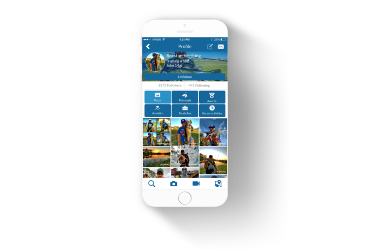
Each user is presented with a profile available for any other community member.
The profile consists of several parts.
Main section provides personal information about the owner of the profile:
- Name
- Short Description
- Photos, which are cropped to fit the circle shape, which is used throughout the application
Statistics section displays:
- The number of followers that the user has
- The number of people this user is following
Below, you can find tabs that allow switching between the content that the user uploaded:
Posts are photos and videos that the users share with the application’s community. The photos can be liked and commented on by other users. The user can apply filters, crop, and add overlays to the media they post. We also applied watermarks in order to protect photo copyrights for users
Fish totals tab contains information on catches that the user logged in. Each catch displays information on the name of the fish, its weight, date, and time when the catch was logged in
Awards tab shows the list of competitions the user took part in, outlining the achievements
Analytics tab presents easy-to-read stats
Tackle Box is where all your purchases from the Drophook are stored
Recent Activities tab helps to track everything – whether you liked or commented on a catch, added a new pin to the map, or did another action important for the app
Private logs and weather
An interactive map will show you the place where you can count for a nice catch. This screen consists of two tabs:
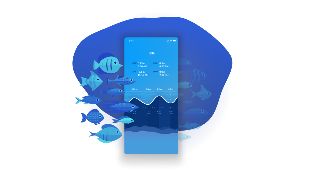
Weather is a great feature that helps you select the best fishing day. Weather shows lots of details like the winds, dew point, humidity, pressure, etc., of course, apart from the regular temperature indications.
Hook Ups is a personal log of places where the user went fishing and of the user’s fishing achievements. When you add a Hook Up, you can add details of the fish that ended up in your basket, tackle details, and even the boat you went on so that if others decide to follow your success, they have all the required details.
Fish totals on the screen would allow you to track how good you are and release overall statistics by tracking the total weight and number of fish you caught.
Photo sharing
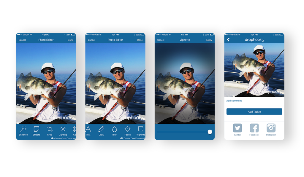
Sharing a photo or a video is pretty simple. You only have to take a photo/video or upload it from your phone.
Then enhance it with a rich number of options such as: Enhance, Effects, Crop, Lighting, Colour, Sharpness, Orientation, Text, Draw, Blur, Focus, Vignette, Stickers, Frames, Overlays, Blemish, Whiten, Redeye, Splash, Meme.
Each option has its own adjustments and configuration that the user can customize to ensure the photo is really good.
Once the user is satisfied with the result, they follow the next step, which supposes adding a comment, hashtags, etc.
To make the process easier, users can quickly add a tackle, which will then be added to Tacklebox.
Sharing on Instagram, Facebook, and Twitter is an excellent addition that would help to drive more viewers.
Tackle
In order to keep track of all tackle that is being used by user, we designed the Tacklebox. Consider it to be a personal box where you can track: bait, lures, jog, fly, teasers spears and arrows, rods reels/bows line, skiffs, knots.
If you need a new one, click “Buy tackle,” which will lead you to the store to purchase the tackle you are missing.
When you add an item to your Tacklebox, you need to fill in the following info:
- upload or take a photo
- add title
- add description
- add brand
- add cost
- add category
Fish measurer
Drophook gives you a nice way to measure the fish. All you need to do is:
- take a photo of a fish
- fit it within a measurer block
- get the approximate length in mm or inches
Once you have completed the measurements, you can log the catch, compete with it in one of the tournaments, or do both.
Strive for excellence with Altamira
Join our community of successful customers, whom we helped to build and grow their businesses.
Road map
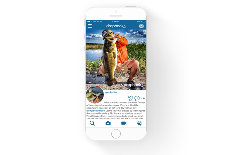
Sidebar
A simple and yet familiar to any user pull-out menu for quick access to main features of the application.
Home
As with any other social network, Drophook’s Home screen is dedicated to the News Feed, which displays the latest stories, photos, videos, and posts of your friends.
Profile
You can edit your personal information and review your entries and professional achievements here.
Hook Ups
This is one of the coolest Drophook’s features. Here, you can directly flag your favourite fish places on the nautical chart and get the weather forecast before going to sea.
Tackle box
It lets you discover new tackles and share your best gear with friends. Just snap a photo, fill in the description, and you are good to go.
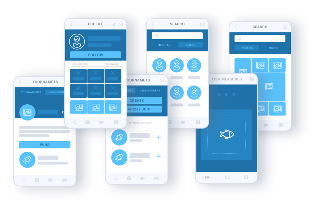
Leader & tournaments
In order to raise the app’s engagement rate, we added a leaderboard and tournament functions that encourage users to share their results.
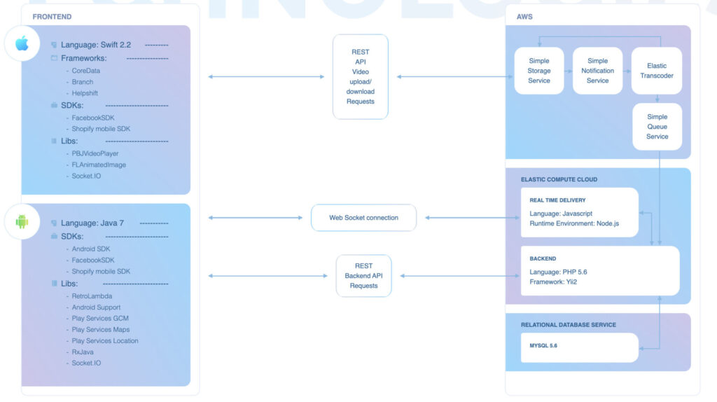
Technologies
Design
Logo
Before designing a logo, we had some preferences and instructions from our Client. We based on existing competitors and wanted to have a hook as the centrepiece of the logo following the title of the application: Drop a Hook
Keeping in mind the fishing hook, we came up with some concepts.
Since our client wanted the logo to be with a text composition rather than a separate symbol, he preferred one variant over the others. And the rest was just a matter of picking the right colour scheme.
Colour scheme
We didn’t have any hesitations in picking the right colour scheme. Of course, we talked about the navy, blue, green or similar palette colours since most of the fishermen associate fishing with this kind of colours.
So, after trying a couple of shades of blue, dark blue was selected since it’s not aggressive for eyesight and has “depth.” White was kept as the background colour. We supposed that users would spend quite some time in the application, so we had to make sure all content was clean, “breathing,” and easy to read, and white colour is the best for it.
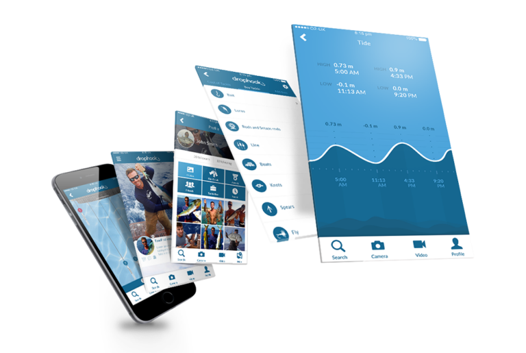
Layout recommendations
The application is really complex, and one of the greatest challenges was to fit everything in a way that would be intuitive and easy to remember. Since a client wanted to give as many shortcuts to users as possible, the application contains a lot of interlinking.
Main menu is hidden behind the left panel to hide long listing. Bottom navigation menu contains the most frequently used options such as search, posting of a photo or video and fish measurer.
When you add a photo, you can quickly add a tackle or log the catch.
When you use fish measurer, you can easily add fish into the tournament for competition without having to go to the tournament page and do all sets of actions again.
03
The Result
Features
- Fish measurer
- Instant messenger
- Facebook signup
- Video posting
- Photo posting
- Tournaments
- Likes
- Map
- Tackle store
- Analytics
- Payments
- Newsfeed
- Weather forecast


