Corporate Website Red Planet
Corporate website development for a trusted software provider

About Red Planet
Red Planet itself drives corporate and startup revenue growth by combining startup inventiveness, speed, and disruption with corporate resources, distribution, and brand power to create new digital solutions. Recently, the company has been acquired by Deloitte. And we were happy to take part in their uprise.
Our Expertise
Web Design
Web Development
Scope
Discovery phase
Product development
Maintenance
Quality Assurance
Vertical
Business Management
Key results
- 1,100+ development hours
- Intense use of AngularJS
See what Altamira can do for you
01
The Challenge
We were asked by uprising revenue growth agency to develop a creative corporate website. Usually, we do not take the work on corporate websites. However, the client’s professionalism and dedication to the work have brought our interest, as well as the intense use of AngularJS and rich animations inside the project.
02
The Solution
Use cases
Navigation
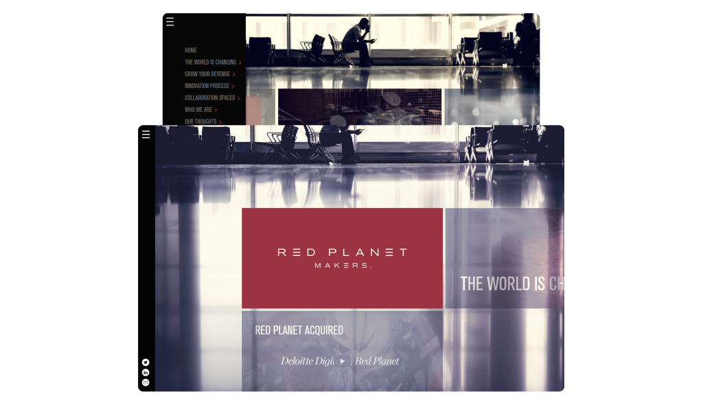
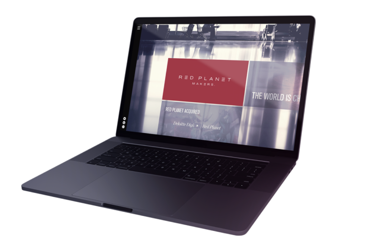
The website design plays around the idea of a multipurpose grid system consisting of tiles. Those are basic structural units used for content ‘carrying.’ All tiles can be swapped and changed, and the content can be edited inside of those tiles.
The website always opens on the central page in the middle of the Main Menu bar. This is a horizontal axis that stands as the anchor on the grid. The Main Menu bar is the website’s central section, and all the other tiles run vertically from it.
Users can navigate from tile to tile using keyboard cursors or mouse or by swiping left-right, up and down on the touchscreen. Alternatively, if you click the right side of the screen, it will take you to the next tile on the main menu, and the left side will take you to the previous tile on the main menu.
Mobile view
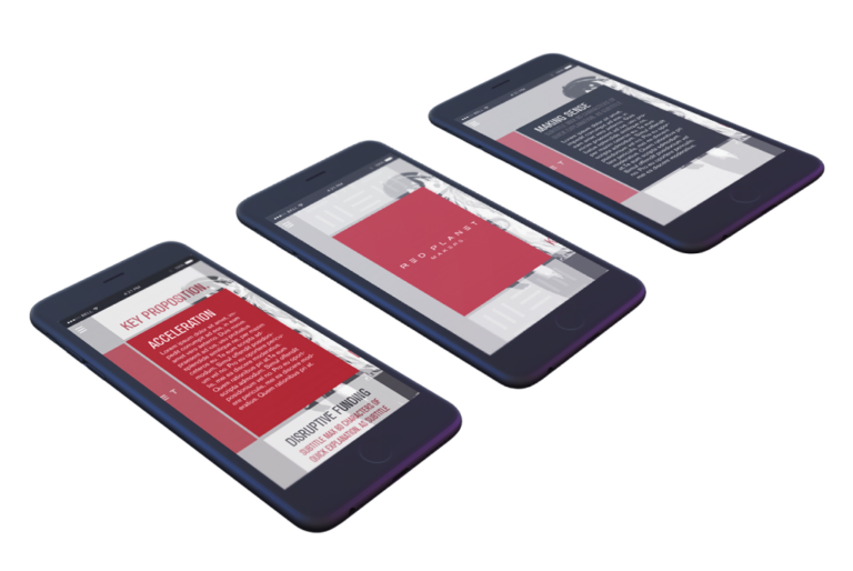
The client chose a landscape orientation of tiles, which works well for tablets and desktops. With a smartphone, however, the landscape mode for the tiles looked too small. Therefore, it was decided to change the tile shape to a portrait for mobile devices. Additionally, the support of portrait orientation was added to tablets.
Extensive admin panel
Our client wanted the ability to change any tile on the website, including the main menu bar. Therefore, we extended administrative access to all the tiles of the website so the client could add new tiles to the existing sections or even create a new section if needed.
When adding a new tile, the editing process is visualised by several steps:
- Choose whether you are creating a main menu tile or a content tile;
- For the main menu tile, the admin can modify only 3 elements: title, background, and font colours;
- For the content tile, the admin has more options: text/form, media/video, gallery, or blog post.
We tried to keep the same sense of motion in the admin panel as on the frontend side. That is why we added the drag-and-drop feature to allow the website’s admin to create new tiles and seamlessly move them to a different position on the grid if desired.

Strive for excellence with Altamira
Join our community of successful customers, whom we helped to build and grow their businesses.
03
The Result
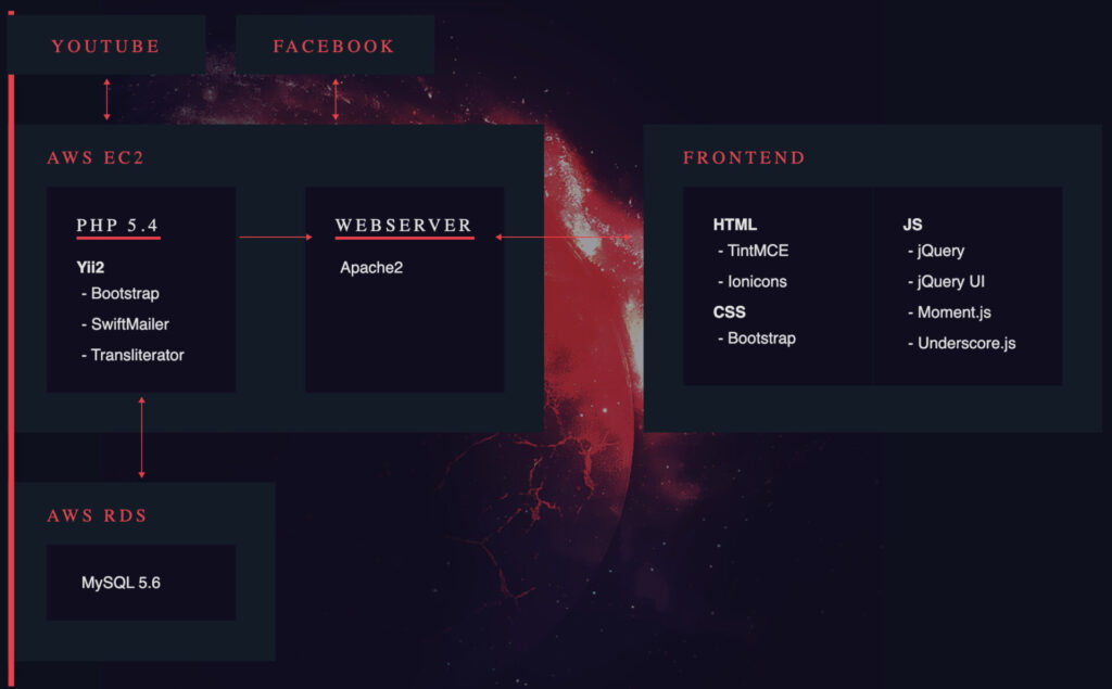
Technologies

Design
Altamira team transferred designs pixel-to-pixel, respecting all the indents and guidelines as the Red Planet team provided them.
Frankly speaking, we are very proud of bringing those designs to life. The website still looks stylish and innovative even after so many years.
Focus point
The focus point is a kind of a “window” onto the grid. It is fixed in the center of the screen where the selected tile is presented with 100% opacity. At the same time, parts of the neighbouring tile are visible, too, but they fade out to the opacity of 50%.
In addition to the opacity ‘trick,’ the background remains still during navigation; this amplifies the focus point additionally.
Sidebar
This side menu bar is represented by the universal menu symbol, which is ironically also the symbol of the Red Planet. This section is mainly made to provide ease of use to recurring visitors. For instance, 70% of visitors use the standard menu button to reach the Contacts section.

Features
- Advanced admin panel
- Intense use of AngularJS
- Seamless website structure


